When you think of Colorado, what comes to mind?
Majestic mountains? Stunning sunsets? For some folks, it’s usually something that has to do with the vibrant mix of landscapes here.
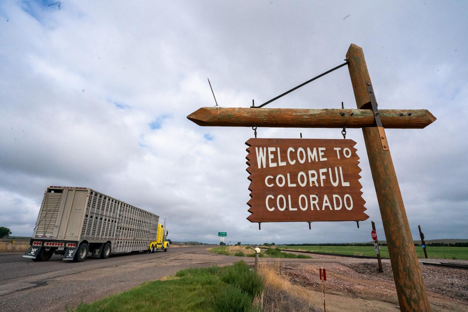
One thing that might not scream “colorful” though is the state’s iconic “Welcome to Colorful Colorado” sign.
“Why is the Colorful Colorado sign brown and white?” someone asked CPR News through our Colorado Wonders series.
"Classic," "boring," "home" and "ironic" were some common responses to describe the design of the sign when CPR News recently asked folks.
We turned to Lisa Schoch, the cultural resources program manager and senior historian with the Colorado Department of Transportation to learn more about the sign’s backstory.
“They're very rustic,” Schoch said. “They are wooden signs that are at our borders – the Utah border, the borders with New Mexico and Wyoming and Kansas.”
There are 40 of these welcome signs. They’re seven feet tall by ten feet wide and steeped in history.
“They're very nostalgic looking,” Schoch notes, highlighting their throwback charm. “They're very representative of a period of time in highway history where if we put up interpretive signs, they were made of timber.”
While the sign itself may be pretty simple, it sure stirs up a lot of opinions and feelings.
Schoch, who has spent 23 years with CDOT, says that people who love the signs are “very emotionally attached to them.” She has a personal connection herself, having grown up in Fruita and being most familiar with the aged sign near the western border and the contrast between it and Utah’s own welcome sign.
“The Utah sign going into Utah is very bright and colorful. And then there's the Colorado sign, which I think is cooler,” she said. “I like things that are older. It's very simple. It's not busy. And I like that sort of classic design, generally.”

That design dates back to the 1950s, with the first one installed at Raton Pass near the New Mexico border. But why brown and white? Schoch admitted, “There's not anything definitive about the color choice.” It likely came down to practicality — timber was the material on hand.
“These in particular represent this time in the past that doesn't exist anymore,” she said. “I understand that sort of confusion about the signage itself not reflecting what the state has to offer. It’s an invitation to explore the colorfulness of Colorado.”
Interestingly, there was an attempt to update the design in the early 1990s.
We asked Coloradans what they thought of our state's welcome sign. Here's what they had to say:

Schoch said the wooden signs were replaced with metal ones that were purple and orange with the slogan: “Welcome to Colorado, mountains and much more.”
The response? Not great.
“People felt that they were too commercialized and wanted the old signs back,” Schoch said.
The original design was reinstated, proving that the classics can be hard to beat.
Today, the signs are handmade by CDOT’s sign shop. They take about two weeks to create, using locally sourced wood and even sprinkled with glass beads for reflectivity.
In the age of smartphones and selfies, the state has also created smaller replica versions and put them up at some welcome centers. It’s a safer option for those eager to snap a photo with the sign without pulling over on the highway or interstate.
“In an effort to sort of address that safety issue, these smaller signs were installed,” Schoch said.
So, next time you see one of these signs as you cross the state line or at a welcome center, take a moment to appreciate its quirky charm and the history it represents. It might not be bursting with color, but it’s full of character — just like Colorado itself.


