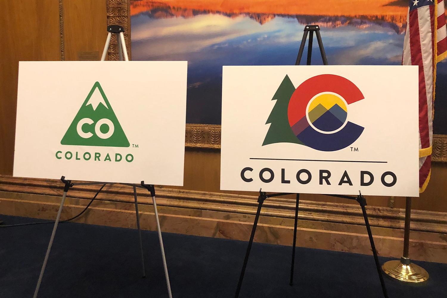
We learned about Colorado's forgotten first flag after it was announced that the state was scrapping its logo, which only debuted a bit more than five years ago. Officials have instead chosen a new design inspired by the current and beloved state flag.
The old logo — tossed out by Gov. Jared Polis — was a green triangle with a white snowcap and the letters "CO" in the middle. It always rubbed some people the wrong way.
"It was all mountains. And when I get tourists coming into the Colorado Welcome Center in Lamar, the fact that Colorado is heavily represented in our icons by mountains — to the exclusion of the Plains — actually leads to a fair number of tourists thinking that the Plains don't even exist in Colorado," historian Jennifer Goodland said.
When Gov. Jared Polis unveiled the new design, he explained that the gold among the new colors represents the Eastern Plains. Red represents earth and the blue naturally stands for water in an effort to make the logo more inclusive.
"I'm glad that Polis has acknowledged that the old logo had some problems, and this new logo actually is a lot more beautiful than the old one," Goodland told Colorado Matters.
Polis said the new insignia borrows from the state flag, which he called "iconic" and full of "brand equity."
Yet the state flag itself is the result of trial and error, according to Brian Trembath, the special collections librarian at the Denver Public Library.
"In 1910, some representatives of the Daughters of the American Revolution were getting together and they decided that it was a terrible thing that Colorado did not have a state flag," he said.
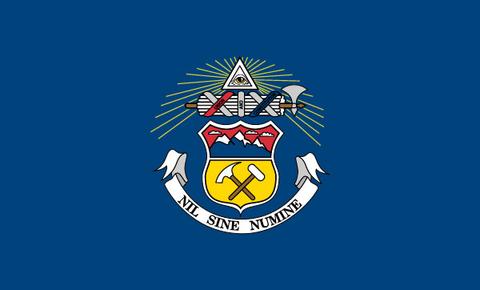
They set about designing one without realizing that the state had, just a few years earlier, already adopted a flag that was relatively unknown — partly because it was kept in a custodian's closet at the Capitol. It was the state seal and motto on a monochrome background.

DAR members had a lot of pull in the legislature, though, and "pretty much got what they wanted, and they got it very quickly," Trembath said.
They put out a call for designs and a man named Andrew Carlisle Carson responded. His design included a horizontal white stripe between two of Yale blue and the large, red "C" with a gold center.
According to the official Senate designation bill from 1911, the Yale blue stripes represent the "ever-smiling skies of the Rocky Mountain region"; the white represents the silver whose mining was the state's economic bedrock as well as the snow on the mountains; blue and white together give us the purple of the columbine — the state flower. The gold center is, of course, for sunshine.
The exact shades of the colors, and size of the "C," weren't set in stone until 1929 and 1964, respectively, but Colorado's distinctive banner was born.
And about that iconic status — Colorado's flag really does have a bit of extra cachet: "In comparison to most state flags, it's always had a very contemporary feel," Trembath said.
"I can remember as a child thinking that it must have been something that was designed relatively recently because it always felt a little more modern, mainly because it didn't use the state seal at all."


